Built by Design
A Thomson Reuters Internal SharePoint Site,
Reimagined by Designers, for Designers
PROJECT OVERVIEW
Thomson Reuters, the world’s leading source of news and professional information, supports Fortune 100 law firms, corporate legal departments, governments, and international tax and accounting firms with custom reports and software solutions. Their mission is to “inform the way forward.”
Design is central to their core products – from industry reports to platforms like WestLaw and Reuters® Pictures. A global team of designers, project managers, and engineers works across time zones to craft these highly specialized digital resources.
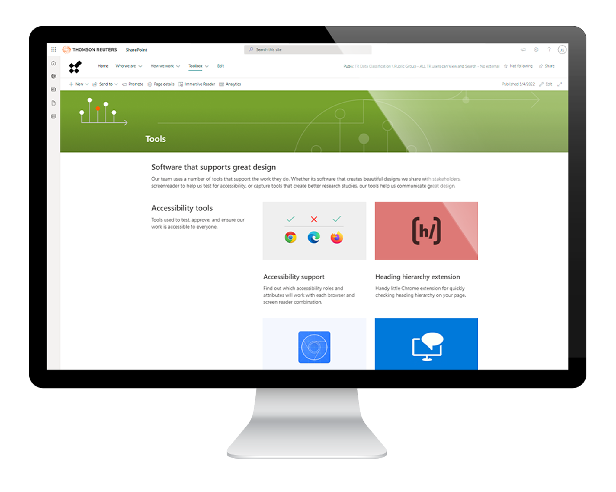
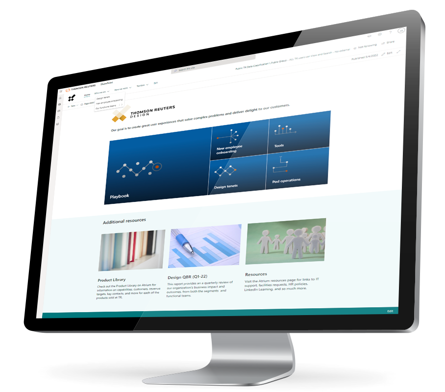
The internal SharePoint site is a vital tool for onboarding and for designers seeking guidance on the Thomson Reuters Design Methodology. However, the existing site was outdated, and users struggled to find key information efficiently.
Thomson Reuters approached Allovus to reimagine the site, aiming to make it visually elegant, easy to navigate, and tailored to a design-savvy audience. Drawing on our experience crafting intuitive interfaces and our expertise in SharePoint, we were eager to take on the challenge.
Duration
Dec 2021 – Jun 2022
Project
UX Design
Web Design
Branding
Iconography
Visual Design
Information Architecture
Tools
Figma
SharePoint
PowerPoint
Roles
Research
UX Design
Visual Design
Copy Writing
Project Management
OUR PROCESS
THE LAY OF THE LAND
Every client engagement is different, but we use proven frameworks for foundational projects like this. To kick things off, we scoped the project by learning directly from the people who use the site.
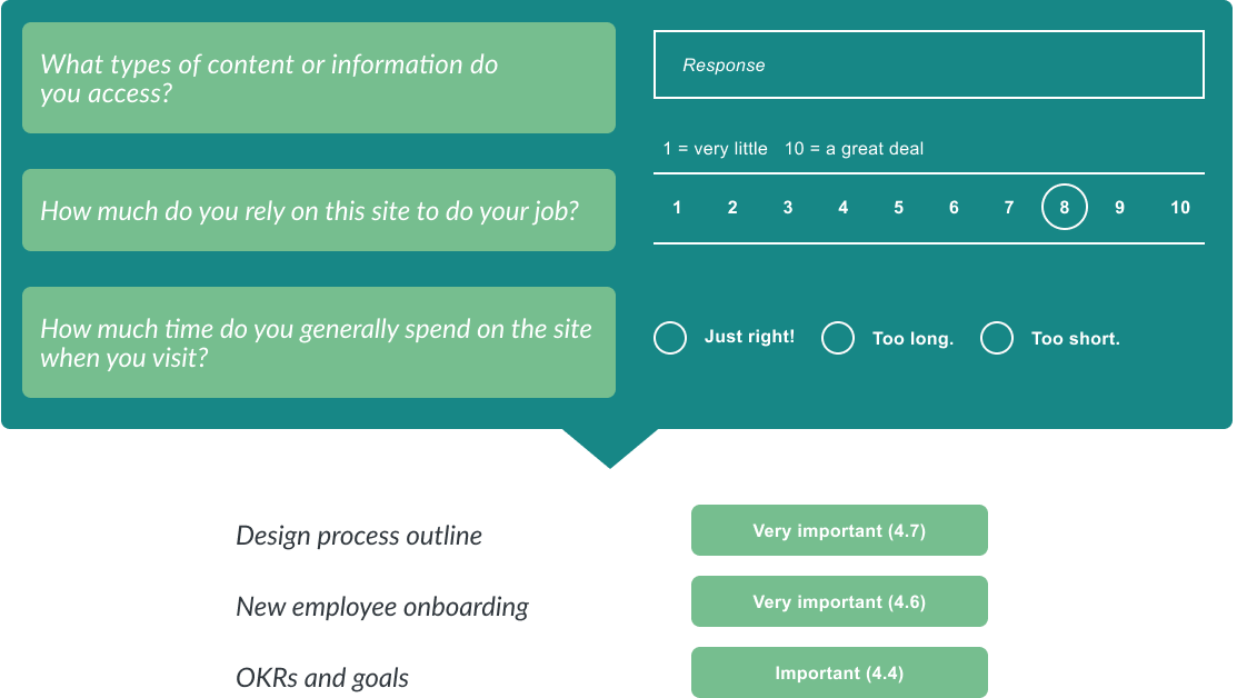
We began with interviews of fifteen Thomson Reuters employees from across the organization – including both new hires and long-term staff. A follow-up survey was then distributed to over 180 employees, asking them to rank the importance of existing site content.
The research helped us identify high-value content, eliminate underused sections, and shape the site’s structure and depth around user needs. A full audit of the existing site gave the client a clear view of their content landscape and a strategy for organizing it going forward.
Our findings confirmed that users wanted a visually guided experience – one that looked and felt like it was made for designers.
THE EXPLORATION BEGINS
We organized several FigJam working sessions with key Thomson Reuters stakeholders. We shared the user feedback gathered and our teams explored content prioritization and categorization for key areas of the site.

MAPPING THE SITE
Initial sitemap drafts helped us evaluate content, test simplified navigation solutions, and identify areas needing new or updated information. They also provided a foundation for estimating page counts during production.

Because this is a SharePoint site, we defined three core page patterns based on content depth — from minimal to comprehensive.


MARKETING ICONS
We collaborated closely on color design and visual expression to ensure the icons would resonate across channels. Using the disc-style gradients as a foundation, we refined hues and added depth through dimensional shading and subtle texture.
A shared grid structure brought consistency, while thoughtful color selection helped unify the system. Designed for flexibility, the icons scale beautifully—whether telling a story on a landing page or supporting a keynote slide.

BANNERS + THEMING
We also created top banners for each section of the site, featuring custom illustrations based on the symbol representing that content area. The colors, symbols, and patterns guide users to the right place – and bring a bit of personality to the experience.
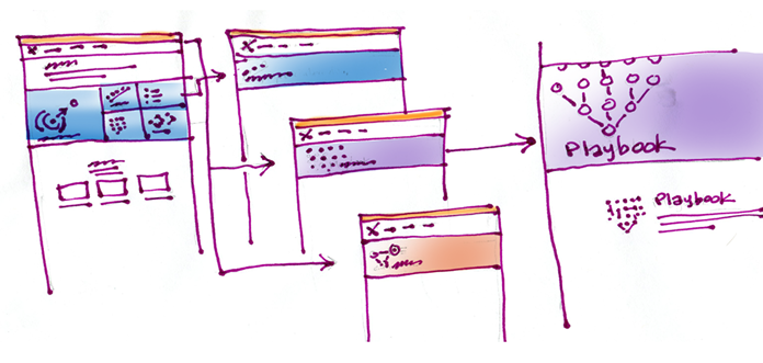
Page header concept exploration

BRINGING IT HOME
Thomson Reuters is a global company that moves at the speed of business, twenty-four hours a day. The existing SharePoint site had to remain in use until the new site was ready for migration. We provided an initial first pass of the SharePoint solution in our own sandbox. This site enabled the client to review content, images, navigation, and site behavior in order to provide a first round of feedback. From there, the final site was built out on the client side and content was migrated from their current site to the new one.
